How can you tell if your carefully-crafted website is getting the ROI you’re after?
Hitting your online sales goals is one key performance indicator, of course. But what if you want to really get into the details and observe exactly how your visitors are interacting on your site? The answer is to use a heat map.
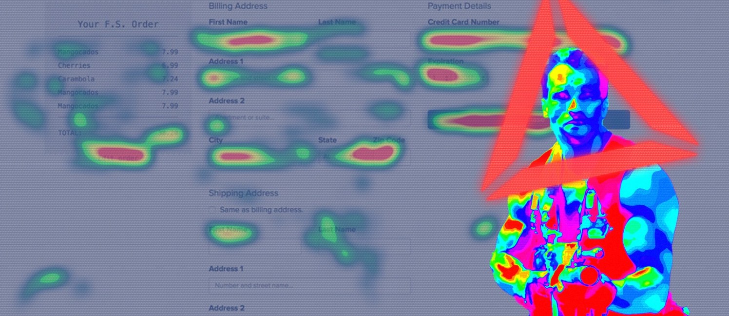
Heat maps is a graphical demonstration of how website users and visitor interact and resonate with your website.
In other words, what works and what’s not.
With visitor data that’s presented in an immediately-understandable visualization, you get facts about your visitors’ activity rather than relying on hunches. This information enables your team to level-up your website and give your visitors the experience they want. Which buttons are they clicking, their cursor movement, their eyes focus and more.
But because heat maps are seemingly easy to use and understand, many marketing teams formulate quick hunches at first glance without taking time to think about best practices. Avoiding the following common mistakes can make the difference between stagnate and stellar.
Not Using Other Analytics Tools Along with Heat Maps
Whether you’re working on a car, building a home or improving a website, numerous tools should be used to complete the job correctly. While you can certainly gain instant and accurate insights using heat maps, other tools (such as Google Analytics) should be used with them to confirm speculations and hunches or to cross reference data.
Perhaps one reason why some marketers use heat maps in isolation is that the graphical representation is easy to present to managers and colleagues. Simple visualizations are indeed a refreshing change from dull and complex Google Analytics reports. But supporting heatmap-driven epiphanies using other tools will keep you from taking the wrong actions.
When presenting the data, it’s always good to use heat maps. Everyone appreciates quick and intuitive visualizations, especially those who aren’t keen on spreadsheets and other traditional analytics
tools. Then, if someone wants more details about the data, break out the Google analytics information you’ve already uncovered. As always, the more preparation, the better.

Not Taking Sample Size or Time-Periods into Consideration
Heat maps are excellent for visual simplicity.
They remove the complexities and numbers that are found in spreadsheet data. But It can be dangerous to make decisions about your website (or even make website changes) when you forget that heat maps aren’t showing you the size of your data set. Are the colors representing 1,000 visitors to your site, or 50,000 visitors? Adjust the settings of your heat map tool to make sure your sample size is representative of your audience.
The sample time-period is also important. If you’ve set your heat map tool to collect data on the first 2,000 visitors, and that number was reached within the first 24 or 48 hours, how can you observe weekday vs. weekend behavior trends?
What about visitor behavior during the beginning of the month vs. the end of the month? Bottomline, you need a lot of data to reach the right conclusion.
Not Segmenting by New Visitors vs Returning VisitorsI
t’s a common mistake to lump all visitors together in the same heat map without differentiating the new from the returning. Returning customers and new visitors behave differently on websites.
Knowing the differences can be very important for seasonal marketing campaigns, special offers, and being aware of how often visitors are coming back to use your site.
You’ll want to see data for each segment because the two heat maps will look significantly different. You also want the ability to know what kinds of information both segments seek, and how they interact differently with your site.

Not Pairing your Heat Map Tool with Visitor Feedback
Once you’ve used a heat map to gain insight into your visitors’ behaviors, it’s time to go a step further by gaining context.
Heat maps give you a big-picture view that tells you what your visitors are doing. But customer feedback enables you to zoom in and learn the specific why’s behind your visitors’ activities.
When you discover roadblocks and drop-offs, feedback can tell you if the problems are related to product pricing, complicated website functionality, a lack of information on your site, or something altogether different. A couple popular website-feedback elements include:
Popup surveys – These are popup windows that ask one or two quick questions about your visitors’ experience. They should be used as a visitor is exiting your site. A popup window could ask something like, “What is your primary concern about making a purchase on our site?” A couple of choices are then given for the visitor to select
Feedback widgets – A feedback widget appears as a button housed at the side of a web page. When a visitor clicks the button, the widget enables them to highlight specific parts of the web page and provide feedback about what’s highlighted.
On-page surveys – This type of feedback survey appears as a small, unobtrusive window at the bottom of the web page. It’s similar in appearance to a chatbot text window.
Not Recording Visitors’ Activity
Heat maps are great for seeing the overall picture of how hundreds or thousands of visitors are interacting with your website. But the best heat-map technology on the market also gives you the ability to record your visitors’ activities at the individual level.
By recording your visitor’s website activity, you get deep insights that shed light on previously unanswered questions. Learn, for example, the pages that are leading to conversions (or falling flat,) how much time specific visitors are spending on different pages, and whether they’re using mobile devices or desktops. You might even be able to ascertain reasons why a large percentage of your visitors are quickly abandoning certain pages.
The more knowledge you have about individual visitor journeys, the easier it will be to turn your website into a well-oiled conversion machine.
Not Blocking IPs
For new web pages that receive very little traffic, you don’t want your heat map to reflect the activity of people from your own company.
If most of the traffic is coming from a company’s representatives (like marketers and web developers,) the heat map won’t be useful. The fix is to set the heat map tool to exclude your company’s IPs, including the IPs of your remote employees.

Best Practices + The Right Tool = Success
It’s key that you don’t let a heat map’s ease-of-use dull your vigilance.
Also remember that not all heat map tools are created equal. Look for one that enables you to record user activity and offers visitor-feedback options. The ability to differentiate between new and returning visitors is important as well.
The bottom line is simple: the right tool combined with the above best practices will enable you to fine tune your site for optimal results.